Erik I

ux

Filed under #ux

A week or two ago I bought some brake parts for my car.

As I entered the site and entered my plate number to get parts recommendations I saw a notice saying that unlike many auto parts webshops they would try to only show me the one relevant part if they knew which part I needed.

As someone who doesn't have much training or experience from the field this felt great. And as only one alternative showed up, and even in a bundle consisting of all the parts I needed I happily added it to the cart and checked out.

Imagine my surprise and when – a few days later – I had raised the car, removed a wheel, disassembled a lot of stuff only to find that the parts were way too small.

The following day I contacted the webshop to ask for an explanation and after waiting for a long time and being hung up on when the first representative tried to transfer my call[0] I finally got through to someone who could tell me what had happened[1]:

  • It turns out my car exists in two editions: a normal edition and a heavy-duty edition. My car is the heavy-duty edition.

  • Also on the webshop there's another ux hack that filters away products that aren't in stock.

Turns out the combination of

  1. Showing only one product if possible (and pointing it out very clearly, causing me to lower my guard)

  2. Not showing out of stock items

  3. The correct part for my car being out of stock

caused me:

  • several days of extra waiting time,

  • extra work as I had to reassemble the car without fixing it and disassemble it again 5 days later to finally fix the problem

  • extra hassle as I have to return the parts I first ordered

Summary: I've previously written that “Good UX is hard. Making things simpler is hard. Part of what makes it hard is that you are supposed to keep the useful properties while simpifying it.”. For me (as a non-designer that just happens to care a lot) this is kind a new category. This isn't the usual ux designer “simplifies” <product > by removing the actual parts that certain users need or ux designer “simplifies” <product> by introducing metaphors that <designer > loves but which are completely unknown to the user base, this – in my book at least- is an actually interesting ux challenge.

compared to a number of my other posts about ux where I wonder what designers were thinking or if they had thought closely about the design at all, this is a more interesting case since in this case it was actually the sum of two somewhat good ux ideas led to very poor ux in the end.

[0]: and here I realize call forwarding might be a good starting point for a new post on ux problems, they seem notoriously hard to get right).

[1]: he could also tell me that I wasn't the first to report this problem and their dev team had already gotten it on their plate.
Filed under #ux and #challenges

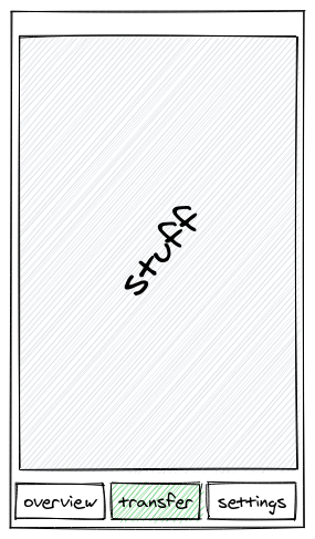
Recently my bank delighted me by replacing the steps to transfer money between my own accounts by a vastly simplified version. Here's what the old version felt like:

Step 01: click transfer

Step 1: First move to the transfer tab.

Step 2.1: click on the from-account field.

Step 2.1: Open the drop down to select an account to transfer money from

Step 2.2: choose correct from-account.

Step 2.2: Select the account to transfer money from

Step 2.3: click select

Step 2.3: Touch Select

Step 3.1: click on the to-account.

Step 3.1: Select the account to transfer money to

Step 3.2 and 3.3: repeat step 2.2 and 2.3.

  • Step 3.2 and 3.3: repeat step 2.2 and 2.3.*

Step 4: click on the amount field, then type an amount and click OK.

Step 4: click on the amount field, then type an amount and click OK (yes, I'm feeling generous here).

Step 5: finally press transfer.

Step 5: finally click transfer

This gets old really fast but I wasn't aware just how bad it was until an improved flow showed up as part of the beta program that I participate in.

I'll leave this here in case anyone wants to give it a stab, and I'll try to get around to posting their solution.

BTW: illustrations are created using the excellent excalidraw, open source and reasonably easy to work with.

Feel free to send me a message @eitland@mstdn.io if you have a better flow. I don't exactly have many readers so I don't expect this to happen but at least it is an option. I don't care. I write because I think writing is smart.

Filed under #ux and #brokenUx

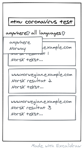
Say you live in a country where English is not the local language and you found an interesting article on a local website. Maybe you want to share it with an English-speaking friend of you, and you have reason to believe there should exist an English post or article somewhere on the web containing the same results.

So you open your search engine and type the words into it. As luck would have it these words can also be valid in your local language so the search engine in its wisdom provides you with local results as shown below:

Searching for something to find an English version of it.

No problem you think: There is a setting where I can choose what language you want your results in.

So you go to the menu where you can change it and you try to change it and you find two choices, all languages or your local language:

Try to change the search language.

OK, fine, I probably just have to set the region first, that almost makes sense (no, it doesn't, buy hey):

Try to change the region.

There are two options and the one that is already selected is the closest I can get.

This used to work, but sometime, somewhere, someone has got paid to create ux sketches to break this and didn't step up to ask what they were thinking, a developer has developed it without saying “are you crazy?” and QA has let it slip.

Or maybe, more likely I am afraid, the story is that they all did it enthusiastically to “simplify the interface”.

Well done: you have now “simplified” a part of the interface that nobody except people like me even think about, only you haven't simplified it or even made it slightly harder to use, you have broken it.

All in an effort to simplify things I guess.

Good UX is hard. Making things simpler is hard. Part of what makes it hard is that you are supposed to keep the useful properties while simpifying it.

Next up: I have created a much simpler and cheaper car. It looks really slick, it is made of cardboard, has no weels, and there is a hole where the driver seat used to be so you can walk around with your car.

Filed under #ux and #chekhovsGun

Sketch of a well known app used for online meetings, showing 4 boxes with 4 portraits of recent participants as well as a small portrait in the bottom right showing a small portrait with the text "+7" overlaid.

Shown above is a sketch of what I saw in a popular app for online meetings.

In the picture there are 4 participants visible, and in the bottom left there is a small portrait with the text “+7” overlaid, indicating there are 7 more participants in the meeting.

Now, quickly tell me, how can I get a list of all the participants?

The obvious answer to me was to try clicking the indicator that told me there are more people in the meeting. In fact it is so obvious that it must be that button (which turns out not to be a button, just an indicator) that I must have tried multiple times already.

That is simple, obvious and wrong.

The correct answer is to tap the screen once, then find the overlay menu, then click the ellipsis symbol in the overlay menu to see the overflow menu, and then you can see the participant list.

Chekhov's gun is a dramatic principle that states that

that states that every element in a story must be necessary, and irrelevant elements should be removed. Elements should not appear to make “false promises” by never coming into play.

This holds true for ui elements as well: If a button doesn't do anything but is only for decoration it probably shouldn't be a button. In this case however it would probably be better to fix the button so it works, I have missed it a number of times already.

I've previously written that Perfect UX is impossible, and I stand by those words, but that doesn't mean we cannot do a whole lot better than we do today.

BTW: Excalidraw is awesome as far as I can see, it is also free/open source software so you can self host it if you want.

Edit 2020-05-06: Add reference to Chekhov's gun

Filed under #rants and #ux

I have an iPad that I like a lot. It is like 4 times quicker than even my flagship Android phones, and it mostly works.

There's one thing I notice however almost every time I use it:

Lack of consistency seems to be considered an UX guideline for iOS apps, and back when I used Mac it was the same there:

In every app that is produced or featured by Apple something is wildly different. Let's take a couple of examples:

Keyboard and tool layout in Notes.

Keyboard and tool layout in Pages.

Can you spot the differences? Here are some starting points: – Undo has moved (next to the keyboard and easy to reach in Notes, top of the page, jammed in next to Table of Contents in Pages.) – Paste doesn't exist in pages, you have to use the “tap the cursor” trick.

iOS/iPad OS is so full of these small annoyances that it seems like there is a UX guideline for it saying that every app should be ever so slightly different.

For the record:

Windows is well on its way in the same direction with the mess that is Control Panel these days.

There are actually a number of things I think were better before, and consistent UX is one of those things that had its peak somewhere around Windows XP and Office 2003. I do not want to go back, but I really wish UX designers would go back and learn to undo the mess that is Metro, Ribbon or in the iOS case the whole mess.

That said: I love my iPad as much as the best PC I had. It is – quick, somewhat predictable: – with the latest patch release I reboot it twice a week every time it jams my keyboard or something – most of the quirks are documented somewhere

I actually like it so much I'm seriously considering getting an iPhone next time I have to get a new phone which is really soon ™ as I'm so extremely fed up with having to wait for Android to switch apps, finding back the state after the other app got killed in the background etc.

Filed under #aifails, #googlefails and #ux

It is 0500 in the morning and I open the app launcher on my phone.

Google:

Do you want to:text a random friend-of-a-friend ordo you want to call a project manager at work?

Me:

No thanks.

<goes on to update this rant from yesterday with a practical example complete with screenshot>

Screenshot showing Android app launcher with AI features.

For the record, I might not be completely, boringly predictable but here are some observations I would have used if I were to suggest what I would be likely to do next:

  • I almost never call anyone at 0500 in the morning
  • And obviously I never randomly contact friends-of-friends using Telegram at 0500 in the morning.
  • I had bought a book on Audible yesterday that I hoped to get started on as soon as possible

This nicely sets the stage for my main point:

In my experience Google Pie AI can compete and win against Microsoft Clippy when it comes to being useless: While Clippy was predictable annoying and never learned, Android Pie AI is unpredictable dumb – and while it might not be as annoying and in your face it might be even more dangerous since it makes it possible to bother others as well.[0]

Why this is is a mystery to me, and while I have some high level ideas for why it ended up this way it seems clear it wasn't meant to be completely moronic, here's what Google said when they launched Android Pie:

Read more...

Filed under #ux, #antipatterns and #weblog

HN discusses this article: https://www.filamentgroup.com/lab/scrollbars/

Discussion: https://news.ycombinator.com/item?id=20951580

Seems HN mostly agrees with me today.

For me this is a perfect example of what I wrote about yesterday: the perfect ux design doesn't exist.

In this case the author has gone to great lengths to create a better ux, only be met with “get off my lawn already!”

I sympathize with people who experience unfair criticism of their hard work.

In this case though, I think the criticism is valid: please please please leave our windows scrollbars alone. There's a reason why we use Windows or Linux – and that reason isn't the price in my case but rather that I far prefer Windows and classic (Gnome 2, KDE) Linux ux to Mac ux.

Updated. And filed under #ux

Updated again today 2020-04-25.

This will be a short one. Promise.

I sometimes rant about ux. You can find some written ones here, and I hope to add more because there's a lot to cover IMO.

That said, I think UX is harder than one might expect:

We just simplified the whole Desktop Environment Experience!

Fine, this will be great for onboarding new users but you just made it a lot harder to use for all existing users.

In addition it seems you made a few changes that needlessly broke existing workflows, and you didn't put in any kind way to configure it.

In the public transport app we now use two minutes between the arrival of one and the departure of next transport. This way we will stop suggesting useless alternatives where you won't catch the second leg!

Fine, but what about disabled people, and what if the first leg is delayed?

We have now increased it to 12 minutes to cover this. We have calculated that this should solve the problem in 98% of the cases.

Fine, but now most people will get a sub optimal schedule.

While I care about disabled users a lot this change means that the alternative that would get me home a lot earlier tonight won't show up because a minority of the users won't be able to get from platform 1 to platform 4 in 11 minutes.


I could go on and on, but I think you get the point: whether your technical solution is good depends on who your users are, if they have previous experience with your application, if they have any disabilities and I'd even say it depends on if the users choice of transport is delayed or not.

All this before we have even start talking about preferences...!

When I work in the field I see quite a lot of statements thrown around, and I have certainly been guilty myself as well (although these are not mine):

vim is the perfect tool for programming

Ask certain kinds of Vim user though and you'll be told in no uncertain terms that Vims ux is close to perfect.

On the other hand I know Vim well enough to know it is not perfect for me (although I'll miss it if it isn't installed.)

Mac has better ux than Windows

Mac has a different ux than Windows. For some it is better, for some it is worse. I've tried it for three years and went from enthusiastic to disappointed, and I usually get along with most operating systems, including CLIs an most desktop environments.

I could add more examples here, but I promised to myself to be short, and also at this point I think I have proven my headline: Creating the perfect UX is impossible because the perfect UX is different between user groups and even between users.

With this giant hint to both myself and my readers about one idea I'll probably present as a possible solution, I'll leave this here and try to get back at some later point with some more practical advice on what can be done.

Filed under #ux and #android

Some time in 2015 I left SwiftKey behind and started depending on the built in keyboard of my phone (Samsung) which I guess had been been licensed or copied from SwiftKey. The reason was that while the predictions where good it had started picking up some bad habits, particularly it would capitalize the letter i even in Norwegian sentences, something that doesn't make sense at all. It had also removed the option to disable auto correct at some point which meant it would “correct” perfectly fine words into funny, embarrassing or dangerous ones (just like iOS do today if you don't stop it.)

Today I reinstalled SwiftKey. The reasons ar GBoard, the standard keyboard app in Android One

  • just can't understand that you can write perfectly fine English on a Norwegian keyboard and therefore insist that you install both (even if it allows you to have English predictions on your Norwegian keyboard as soon as you have installed the English keyboard.)

  • this would have been OK if it wasn't for the fact that keyboard layout would sometimes change for apparently no good reason.

So far SwiftKey has impressed me today. Intelligent predictions, no snags, neither in English nor in Norwegian.

And GBoard, just like SwiftKey 4 years ago just doesn't seem to get it.

One thing to be aware of though:

If privacy is important to you, make sure you take the time to prevent sending of snippets back to SwiftKey. These settings are located in at least two different places, just so you are aware.

Filed under #ux

This is a minor annoyance but lately I've been working on Windows again and then it comes up multiple times a week.

Somewhere the last few years[0] Microsoft has started displaying really nice backgrounds on the login screen.

I like them a lot: Scottish mountains for example looks a lot like the mountains I grew up and they make me happy.

Then there is some kind of crude voting button in the top right corner where it asks me if I like the image or not. If I answer yes it will tell me something along the lines of “Fine, we'll show you more images like this.” and if I say no it will immediately switch to another image.

So far, so good, only sometimes it overlays the image with text and sometimes not. And sometimes that text is ads. And that is infuriating when I'm looking at a paid OS.

Other times there are no explanation of what I'm looking at.

But every time it only asks if I like the picture. And the answer to that is yes, I only wish that they would be consistent in telling me where it is from and avoid spamming my login screen, but there is no way to enter generic feedback

[0]: I don't follow Windows very closely and hasn't done so for years as it might take months between every time I use a Windows machine on a daily basis.