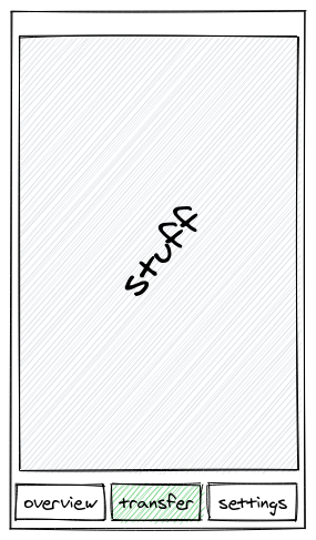
UX challenge: transfer money between accounts
Filed under #ux and #challenges
Recently my bank delighted me by replacing the steps to transfer money between my own accounts by a vastly simplified version. Here's what the old version felt like:

Step 1: First move to the transfer tab.

Step 2.1: Open the drop down to select an account to transfer money from

Step 2.2: Select the account to transfer money from

Step 2.3: Touch Select

Step 3.1: Select the account to transfer money to

- Step 3.2 and 3.3: repeat step 2.2 and 2.3.*

Step 4: click on the amount field, then type an amount and click OK (yes, I'm feeling generous here).

Step 5: finally click transfer
This gets old really fast but I wasn't aware just how bad it was until an improved flow showed up as part of the beta program that I participate in.
I'll leave this here in case anyone wants to give it a stab, and I'll try to get around to posting their solution.
BTW: illustrations are created using the excellent excalidraw, open source and reasonably easy to work with.
Feel free to send me a message @eitland@mstdn.io if you have a better flow. I don't exactly have many readers so I don't expect this to happen but at least it is an option. I don't care. I write because I think writing is smart.